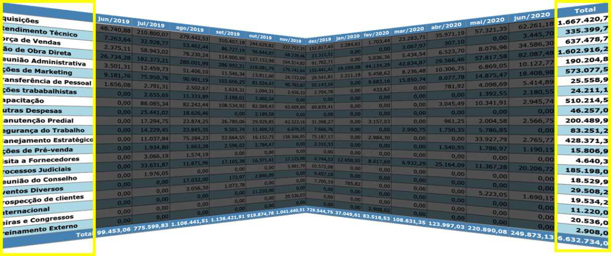
Overview first
The outer rows and columns generate a summary table and automatic charts — the dataset's overview appears before any detail.
 R&D Prototypes
HyperAnalyzer offers complementary ways of visualizing structured data, integrating interaction and Shneiderman's mantra so users can choose the strategy that best fits their analysis.
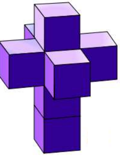
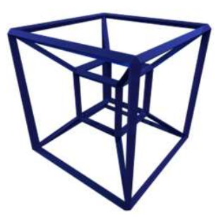
A dataset with “groupable” columns (GROUP BY) and “aggregatable” columns (SUM, COUNT, AVG) is, in practice, a cube. Traditional OLAP visualization treats it as an unfolded cube, harming understanding through the loss of spatial relations.
HyperAnalyzer keeps those relations: the user prepares the data — delimiting columns, transposing, adding custom calculations and generating charts — and creates new faces with the transformed data. From there, they build sequences for presentation, compare side by side and apply the “depth and surface” technique.
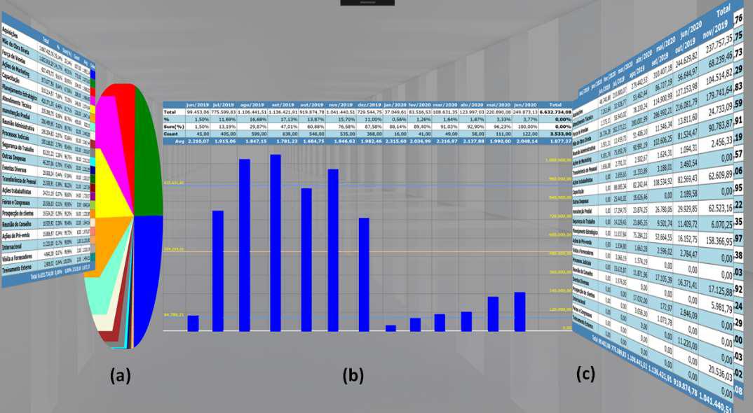
The interaction strategies that guide the analysis, following the mantra “overview first, zoom and filter, details on demand”.
The outer rows and columns generate a summary table and automatic charts — the dataset's overview appears before any detail.
Generate segmented visualizations — by quarterly review or by category — with calculations performed only on the selected subset.
Transpose columns, add your own calculations and generate charts; each transformation becomes a new face to compare side by side.
Dive into a segment without losing the overall context, switching between the surface of the data and the depth of the analysis.
Why unfolding destroys understanding — and how dimensional visualization preserves it.
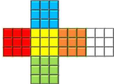
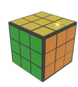
From overview faces to detailed segments, in the order the analysis demands.
In the cube report split into side-by-side visualization, the outer columns stand out and generate the pie chart; applying the same criterion to the rows produces the bar chart. Being the “overview”, outer rows and columns appear first. From those insights, you can generate segmented visualizations with zoom and filter — for example, a quarterly review or a breakdown by category — with calculations performed only on the selected set.